Fork Ranger (WIP): Scaling Impact through UX/UI design
Fork Ranger is tackling climate change through food by making climate-conscious eating simple and accessible. Their mission is to use data and compelling storytelling to guide users toward sustainable choices and turn knowledge into action through easy recipes.

My role
As a retained product designer, I dedicate a few hours each week to designing critical new features for the Fork Ranger iOS app, ensuring the user experience is intuitive, effective, and aligns with their mission. Sprint & workflow We collaborate using a flexible, feature-focused sprint methodology to keep the app evolving quickly. Our process involves: Task Selection: We begin by selecting 1–3 high-impact tasks directly from the backlog (managed in Linear), ensuring strict focus and measurable results. Sprint Duration: Sprints typically run 3–4 weeks, allowing sufficient time for concept development, design, and developer handoff. Defining the MVE: Our core challenge is determining the "Minimum Viable Experience" (MVE) for every new feature. We strictly define the essential requirements needed to get a feature live and testable. Prioritization & Iteration: Two key factors guide our MVE decisions: design/build velocity and technical feasibility. We aim for the fastest path to launch without sacrificing utility. From there, we collect user feedback on Version 1 and iterate on the features as needed.

Building a recipe filter
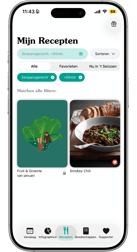
The Challenge While users had long requested a filter feature, the app originally only supported basic sorting. The challenge wasn't just technical; it was defining the right filtering logic. We needed to move beyond assumptions to understand exactly how users decide what to cook and what specific criteria (ingredients, time, preferences) matter most to them. Solution We began with a survey among active users to understand their decision-making models, followed by a competitive analysis of similar apps. This research informed our Information Architecture, ensuring the filter options matched user mental models. During the design phase, we focused heavily on edge cases, such as designing helpful "empty states" (when no results are found) and defining how the search bar behaves when multiple ingredients are selected. We also established a clear scope, deciding that features like "plan to cook" were outside the MVE for this specific filter update. Result The final design features a refined Information Architecture that prioritizes the most-used filter categories, backed by our survey data. The result is a seamless search experience that handles both active filtering and empty states gracefully. The images below illustrate the process: